Latest Posts by misterdoccy - Page 5
updated splatsona

uhh please reblog !!!!


wow didnt post there for a long time
anyways weird littel freaks from the garten of the ban the ban bannnnbannn


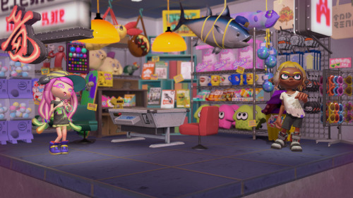
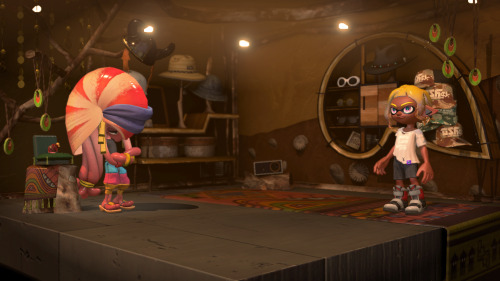
Shops!

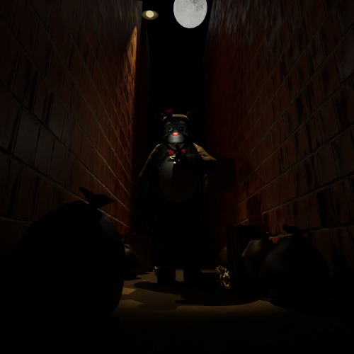
mr coco clips into the wall lol
Freddy Fazbear's Pizza ( 1988 - 1993 )


I think he should be put somewhere far away from that crusty ass town
Sophie walten


silly octo has a new reference sheet


Hiii i started to draw some stuff on paper bc my pc broke so yeaaaah SIDE ORDER IS SO SILLY!!?


re did fridays ref sheet! :333

deep cut redraw :D

i love her glamrcok chica is so cool and silly
probably an unpopular opinion but i still think Splatoon 1 has the best graphics style in the series
the graphics were so much moodier and darker, shadows were really prominent giving it a much more gritty and realistic feel


The far-off environmental elements had a nice blur that gives them a bit of a dreamlike quality IMO.


I know the top picture is a sunset level, but; seriously is it just me? Why is everything in Splatoon 2 SO CRISP AND BRIGHT AND NEON? I talked about (probably 2 years ago at this point) how Splatoon 2 feels like it's an evolution and commercialization of Turf Wars into a product and a brand rather than how in Splatoon 1 they had a much more backstreet, discreet, shady feeling. And I feel like the graphics carry that over weirdly enough.
But most importantly, the ink and the Inklings themselves; ever since Splatoon 2 came out and people started going "omg the ink looks so good now!" i. literally never agreed with that. even with Splatoon 3 i STILL THINK the ink looks the best in Splatoon 1. In Splatoon 2 and 3, they have really been leaning into making the ink extremely neon and super saturated, and I don't think it looks great. I can't really even pinpoint the difference here (especially not with the Inklings themselves, but).


(Splatoon 1 above, Splatoon 2 under)
The Inklings in humanoid form don't stray away from having dull or dark colored tentacles in different lighting conditions, and even the ink itself is nowhere near as saturated as it is, leaning more into quieter or pastel tones. Again, it makes it look nice paired with the darker graphics of the game, and somehow it feels really at home and pretty natural? The difference in the model of the Inkling itself is also a mystery of me, it might be a case of less shading or less specular making it look flatter and that's more pleasing to the eye than how shiny they are nowadays, ESPECIALLY in Splatoon 2. The ink is notably flatter than it is in newer games, and if it wasn't obvious I definitely think it still just, looks the best? Don't ask me how. (The squids also look amazing. Like gummy.)


just thought about putting that out there. Anyone else's thoughts on the games' graphics?

The Fire starter🔥
Part Of The WarSla Region

popgoes redesigns

The grass starter🍃
Part Of The WarSla Region

friday in tableturf :3
An attack for @cambriancutie !!!!!! I spent so long on this and it's finally done TvT
I love your designs and I've been wanting to do something with it for a while, and I thought they were perfect!
This was posted on youtube too!!


HATERS WILL SEE YOU TELEPORT AND BE LIKE "HE CANT AFFORD PATCH 1.1.1"


literally all I could think about when they interacted like 2 times

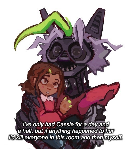
OMG I LOVE RUIN AND I LOVE CASSIE SHES SO COOL
Puppet and lefty! In my style


Evolution of Bonnie

toy chica redraw bc silly meow meow

blue loves to kiss mann
also all of the clouths are pattern on his body and the hat is a blub he is organical :3333

blue loves to kiss mann
also all of the clouths are pattern on his body and the hat is a blub he is organical :3333

he has no idea whats he doing
snipewrriter is sooo fun meow meow i normaly dont like chargers but snipewrriter meow silly :33

he has no idea whats he doing
snipewrriter is sooo fun meow meow i normaly dont like chargers but snipewrriter meow silly :33


